Editor’s note: This is the third in a series of posts by Lemelson Fellow Aimi Hamraie. At the time of writing, Hamraie was a PhD candidate in Women’s, Gender, and Sexuality Studies at Emory University. Their dissertation examined Universal Design and disability. Their blogs will discuss accessibility features at the Smithsonian, particularly the National Museum of American History. As of 2021, Hamraie is Associate Professor of Medicine, Health, & Society and American Studies at Vanderbilt University, director of the Critical Design Lab, author of Building Access: Universal Design and the Politics of Disability (University of Minnesota Press, 2017), and host of the Contra* podcast on disability, design justice, and the lifeworld.
My last two posts covered the topic of Universal Design in the museum in terms of structural features, such as ramps, and educational features involving sensory information.
In this post, I am going to discuss some of the technological features of accessibility at the National Museum of American History.
You may remember from my first post on America on the Move that the exhibit has a number of computer kiosks at each major site.
These kiosks are an example of Universal Design because they provide the same information in several ways—through interaction with the screen, text, and audio of the text, and in different languages. This means that international visitors can access the exhibits, and that if one kind of display, such as text or sound, is not accessible, another type is available.
A new exhibit, American Stories, uses a crowdsourcing app to help visitors understand how objects are important to the way that we talk about the history of the United States. Upon entering American Stories, a sign tells you in both English and Spanish that an app is available for the exhibit. The large, oval-shaped, red and yellow sign has information on how to download the app on your smart phone, if you have one.
The sign tells you how to participate in using the crowdsourcing functions of the app, or how to just listen if that is what you would rather do. This app was developed by the Smithsonian Institution Accessibility Program, using existing open-source software and adapting it for museum use.
You may notice that the sign does not say anything about this app being a feature for disability access. This is because as a Universal Design feature it is usable by a range of people seeking information in the exhibit. What makes this app interesting and significant, however, is the fact that it is accessible to people with disabilities, who can record their own perceptions and experiences with the objects of the exhibit for other people to hear. Including the voices of people who are often excluded from accessing spaces where knowledge is shared, like museums and schools, in the exhibit itself shows that people with disabilities are valuable parts of the public and have important things to say about the history of the United States.
How does the app work?
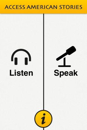
You may notice from the images of the menu that it is a clear and easy to read interface. The text is in a sans serif font. The parts of the menu with text feature high-contrast text, with the text itself in white and the background in either black or dark turquoise blue. This is another Universal Design feature—it helps make the text more visible and readable.You also have the choice of recording something about one of the objects, describing something else that should be included, talking about your experience in the exhibit, or responding to someone else’s recording.
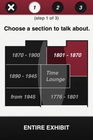
Another feature of the app is a map, again in high contrast, with white text on a black background, that shows the layout of the exhibit. You can choose which part of the exhibit you want to talk or hear about through the app using the map. This is both a part of the function of the app itself, and a way of helping with wayfinding within the exhibit.This image of Step 3 of recording through the app uses high contrast text, this time with black sans serif text on a white background. It also uses large, intuitive, and easy to understand icons that are explained within the menu. Using this menu, you may record and upload commentary on an object.
Individual technologies like smartphones are making it possible to provide information to visitors in museums in a range of ways. Whereas some exhibits must build accessibility into their structure—by placing placards at certain heights and making sure to have kiosks with sound or screens with captioning—smartphones are now becoming able to provide multiple sources of data (text, sound, and even haptic feedback) to users. They can be mounted on stands, attached to arms, and used without a lot of upper body strength. Most importantly, these devices move through exhibits with the visitor. If a sign is not at the right height, the device can still provide the same information. If audio is unclear, it can be replayed.There are, of course, access issues that are raised any time technology is used. For example, not everyone has access to smart phone technologies. However, the Museum is working on a pilot program that involves checking out iPhones and iPads to visitors on a provisional basis. (Apple technologies are designed with Universal Design in mind—and have been around almost as long as the company itself has existed.) Designing an app that is usable on these technologies also makes it possible to use voice recognition, screen readers, and screen magnification to enhance the accessibility of the experience.
Both software and hardware developments allow users to choose how they receive and provide information. (For more information on accessibility research on wireless devices, such as cell phones, see the work of the Wireless RERC at the Georgia Institute of Technology.)
It will be exciting to see how this app is further developed to incorporate usability for languages beyond English and Spanish, and also whether it will set a standard for interaction and accessibility in other exhibits. Future versions could have text transcription of the audio, or incorporate video and other kinds of crowdsourced information.
One last bit of Universal Design: American Stories, like many of the museum’s exhibits, has a website, where you can access images and information about many of the things in the exhibit no matter where you are.


